
Visual insights
Visualise Your Cash Flow
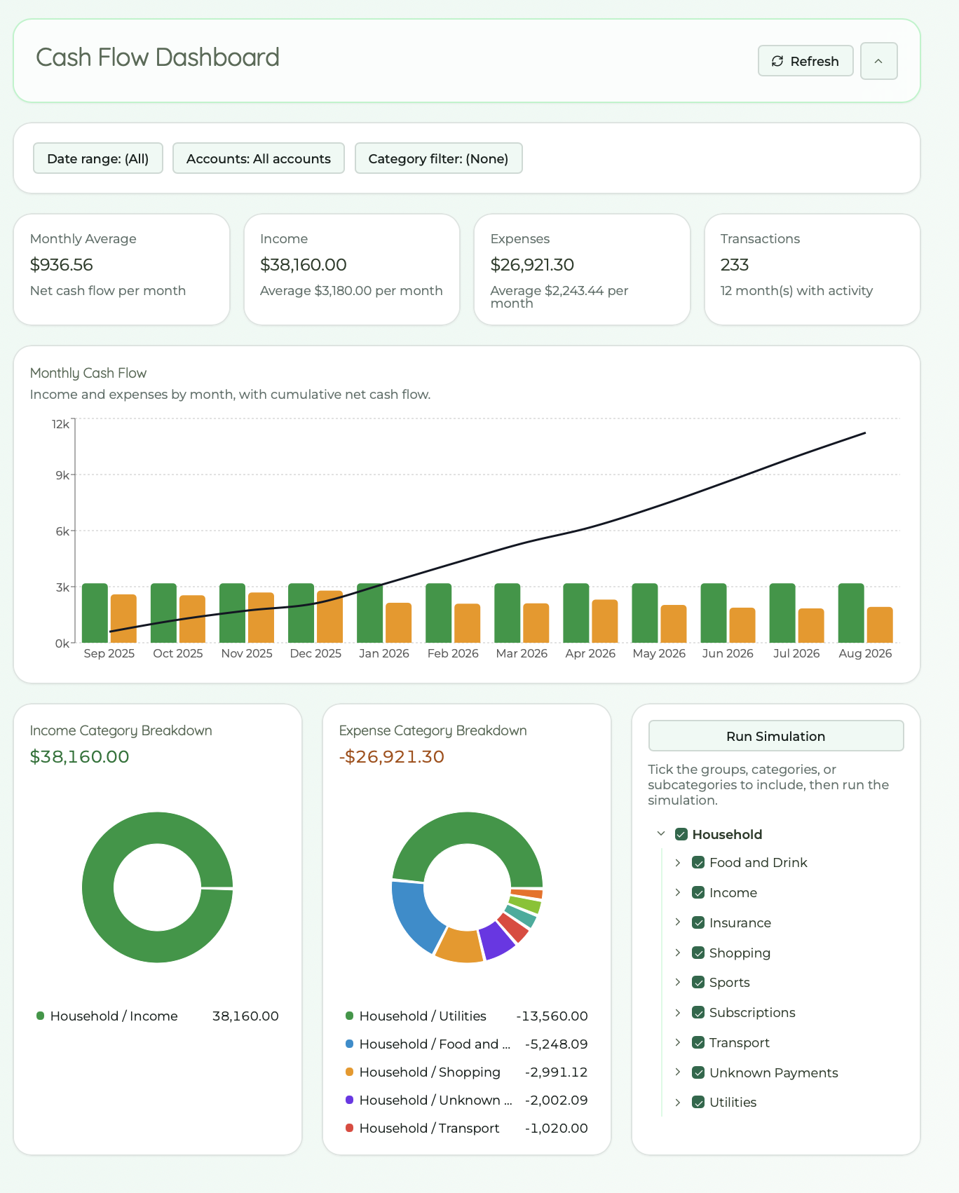
Charts turn your categorised transactions into patterns you can see at a glance, then drill down when something needs a closer look.
- Bar charts by category or month
- Spending mix at a glance
- Trends over time
- Headline income and expense stats
What if?
Run Simulations
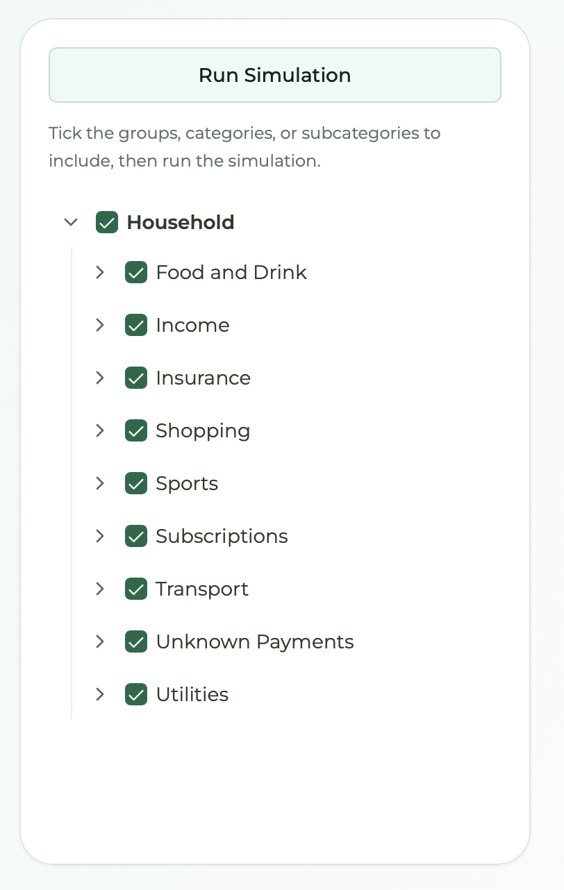
The Run Simulation box lets you include and exclude categories and subcategories and see exactly what that does to your cash flow. Tick what stays in, untick what you want to take out, hit Run Simulation, and the charts and headline totals update to show the result.
Wondering what would happen if you did not have to pay for a particular category, or one subcategory within it? Drop it from the simulation and the dashboard shows what your cash flow would have looked like without that spending. Not a guess. The same charts and totals, recalculated from your real transactions with that piece removed.
It is a simple way to test a theory before you act on it: what if we cancelled that subscription, cut back on dining out, or stopped paying for a whole category of expenses? Run the simulation and see the answer in the numbers.
From pattern to proof
Drill Down to Details
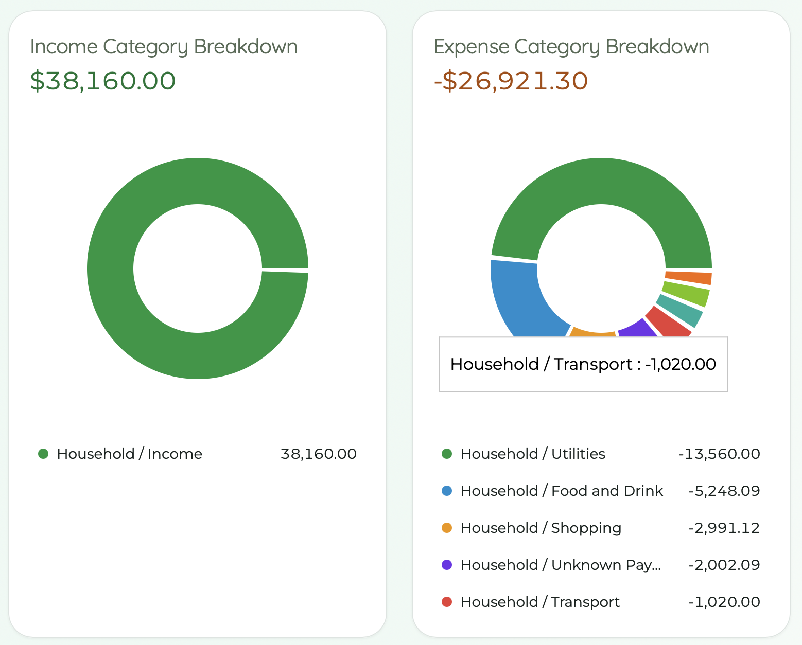
When a chart raises a question, drill down to the underlying transactions. The dashboard connects high-level patterns to individual line items so you can understand what changed and why. A total on the dashboard isn't just a total, it's a shortcut to the transactions behind it.
What It's For
The dashboard is a useful visualisation of trends. It uses exactly the same data as the cash flow table, just shown differently: as charts instead of rows and columns. Nothing is calculated twice or pulled from somewhere else. What you see in a bar, a pie slice, or a line is the same spending and income you would see in the table.
That lets you perform higher-level analysis than scanning numbers alone. A graph makes it much faster to spot whether something is trending in the right direction: income holding steady, expenses creeping up, one category quietly growing month after month. You get the shape of your finances at a glance, then drill down or switch to the table when you need the detail behind a trend.

Explore Your Dashboard
Start a 28-day free trial and see your spending patterns in charts within your first session.
General information only, not personal financial advice. Read the FAQ