
The Cost-of-Living Crisis: See Where Your Money Actually Goes
Energy, rent, the weekly shop, the mortgage if you have one. The cost-of-living crisis is real, and most of what is driving it is decided a long way from your kitchen table.
The part you can act on is your own spending — and the honest difficulty there is that hardly anyone can see theirs clearly enough to make good decisions. “Cut back” is not a plan when you do not know what you are spending to begin with.

By Patrick, Founder
What is actually driving the UK cost-of-living crisis?
“Inflation” is the headline, but it does not hit every bill the same way. Some costs have barely shifted; a few have jumped hard, and the average buries that. Here is where the pressure sits.
Energy and housing are doing most of the work. If you rent, it is the rent; if you have a mortgage, it is the effect of higher rates as fixed deals end and people remortgage onto something dearer. Food, insurance and council tax sit on top. If your pay has crept up while three or four of those have climbed steeply, the squeeze is real even when the headline figure sounds mild. Here is why prices rise in the first place and why a “low” rate still bites.
Twenty years of inflation, interest rates and the market
Inflation and the Bank of England’s rate move together — the rate is the main tool used to pull inflation back down. The telling line is the third one: through every rate cycle and the 2022 spike, the share market kept climbing. The households that came out ahead mostly owned assets and held debt. Cash did the opposite.
How you actually get ahead of it

The chart holds a blunt lesson. Over the two decades, the same three things kept happening:
- Assets rose with inflation. Property and shares had bad years, but across 20 years they climbed well ahead of prices.
- Fixed debt shrank in real terms. A loan set at a fixed rate got easier to carry every year that wages and prices rose around a repayment that did not move.
- Cash lost, every year, near enough guaranteed. Money left in a low-interest account bought a little less each year with nothing to show for the wait.
The households that came out ahead were not smarter. They were positioned — holding some assets, carrying some fixed debt, and not sitting on more cash than they needed.
In the middle of a squeeze, “own assets” can sound like advice for someone else, and it is harder now than it was. But two things are worth knowing. If you pay into a workplace pension, you are already on the winning side of part of this whether you think about it or not — that money is invested, and it has been riding the same climb as the chart’s third line. And the one move fully within reach is the boring one: see where your money goes, find the margin, and use it so you are not left entirely in cash and entirely behind. That is what the rest of this page is about. Building on that margin is a separate question — but you cannot get there while the money is invisible.
The part you can’t control, and the part you can

You do not set the Bank of England’s rate. You cannot argue your rent back to last year, or step outside the energy market. Those levers belong to other people, and the news will keep saying so.
The one lever that is fully yours is what leaves your account each month — and it is the one most people cannot describe accurately. Ask what you spent on food, or subscriptions, or takeaways last month and the answer is a guess, and usually on the low side. You cannot make a sound decision about a figure you are guessing at.
You can’t cut what you can’t see
Where Does My Money Go takes the bank and card statements you already download and turns them into a single cash flow table: money in and money out, by category, by month, side by side. A year of transactions becomes one page you can read in a few minutes.
That is what changes the conversation. Instead of “we should spend less,” you are looking at “£520 a month on the food shop, £140 on subscriptions and streaming, £300 on eating out and coffee, £120 on things I could not tell you about.” The categories are yours, set through simple rules, so the table matches how you think about your money.
Deciding what you’re actually willing to lose
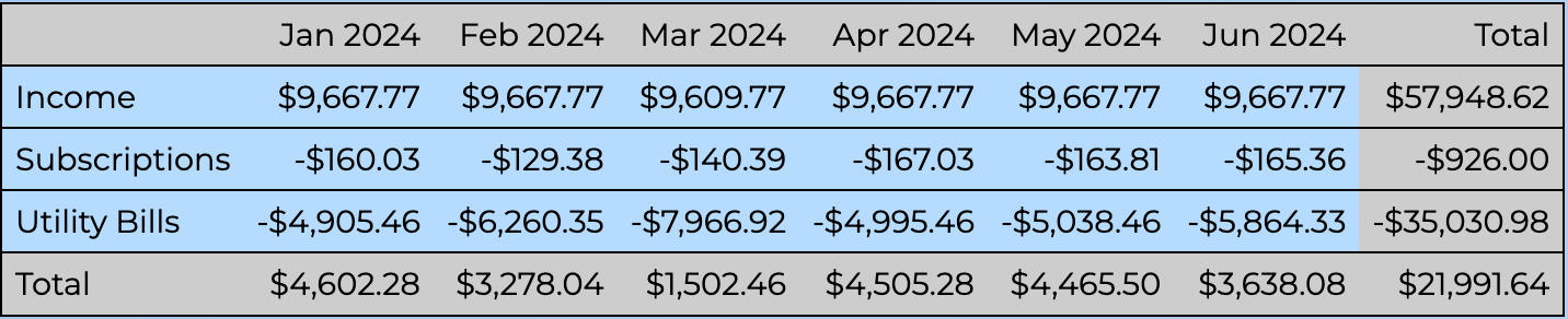
Most cost-of-living advice hands you a list of what you should cut. Real households do not work like that. Some people will cancel every subscription before they give up the daily coffee; others the other way round. The value of seeing the numbers is that you make that trade on purpose, with the size of each choice in front of you.
What the table tends to bring to the surface:
- Small recurring charges that quietly add up to more than the occasional big purchase you feel bad about.
- Annual and quarterly bills — insurance, car tax, water — that never appear in a “normal month” and wreck the budget when they land.
- Categories where the number is simply bigger than you assumed, which is usually where the easy savings are.
The app does not budget for you or nag. It shows you the picture and leaves the decision with you.
Keep a buffer for the lumpy stuff
Cutting is only half the job. The other half is not being knocked over by the irregular costs — a car repair, an excess, a remortgage onto a higher rate. A modest cash buffer is what stops a bad month turning into new borrowing, which is the last thing you want when money is already tight. How much you actually need set aside depends on your real cost of living — the figure the cash flow table gives you.
How it works
- Download a statement from your bank. Linking your bank login is not required.
- Answer a few questions as the app learns your categories. Answering them is how you start to see the shape of your spending.
- Open the cash flow table. Read the year in a few minutes, find the categories that are bigger than they should be, and decide what changes.
- Come back monthly. It stays current, so you can see whether the changes stuck.
None of this makes energy cheaper. It makes the one part of the problem you control something you can act on, rather than something you are guessing at.
Disclaimer: We are not financial advisers. The information on this website is general in nature and does not take into account your individual circumstances. You should seek independent professional advice before making financial decisions.

Feeling the squeeze?
Work Out What You Can Cut
Start a 28-day free trial and turn your bank statements into one cash flow table, and see the size of every choice before you make it.